

2010 | Singapore | Branding & Interior design
A new venture under the Bakery Depot group that differentiates itself by creating dessert concepts that appeal to a young but increasingly sophisticated crowd.
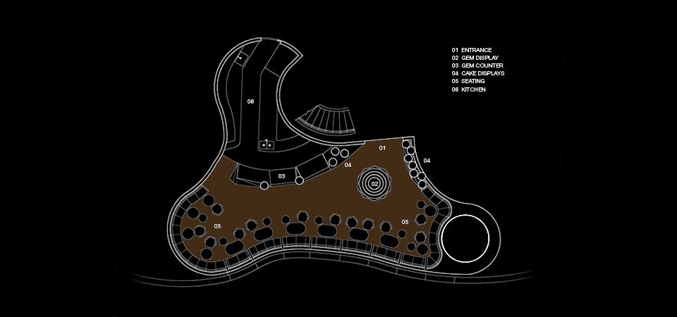
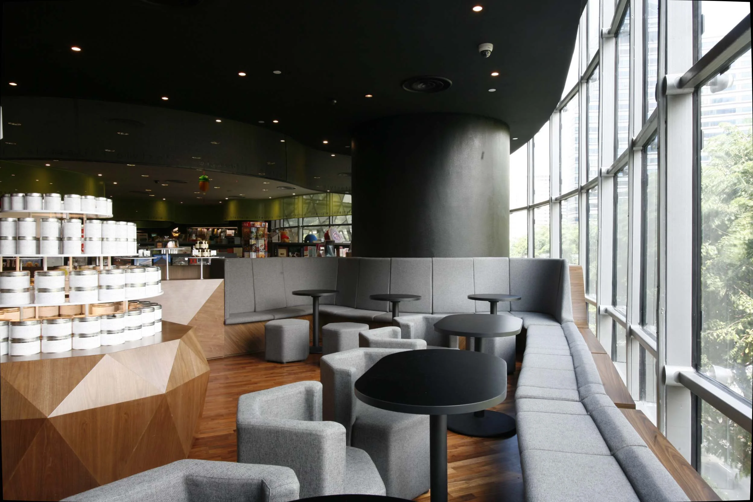
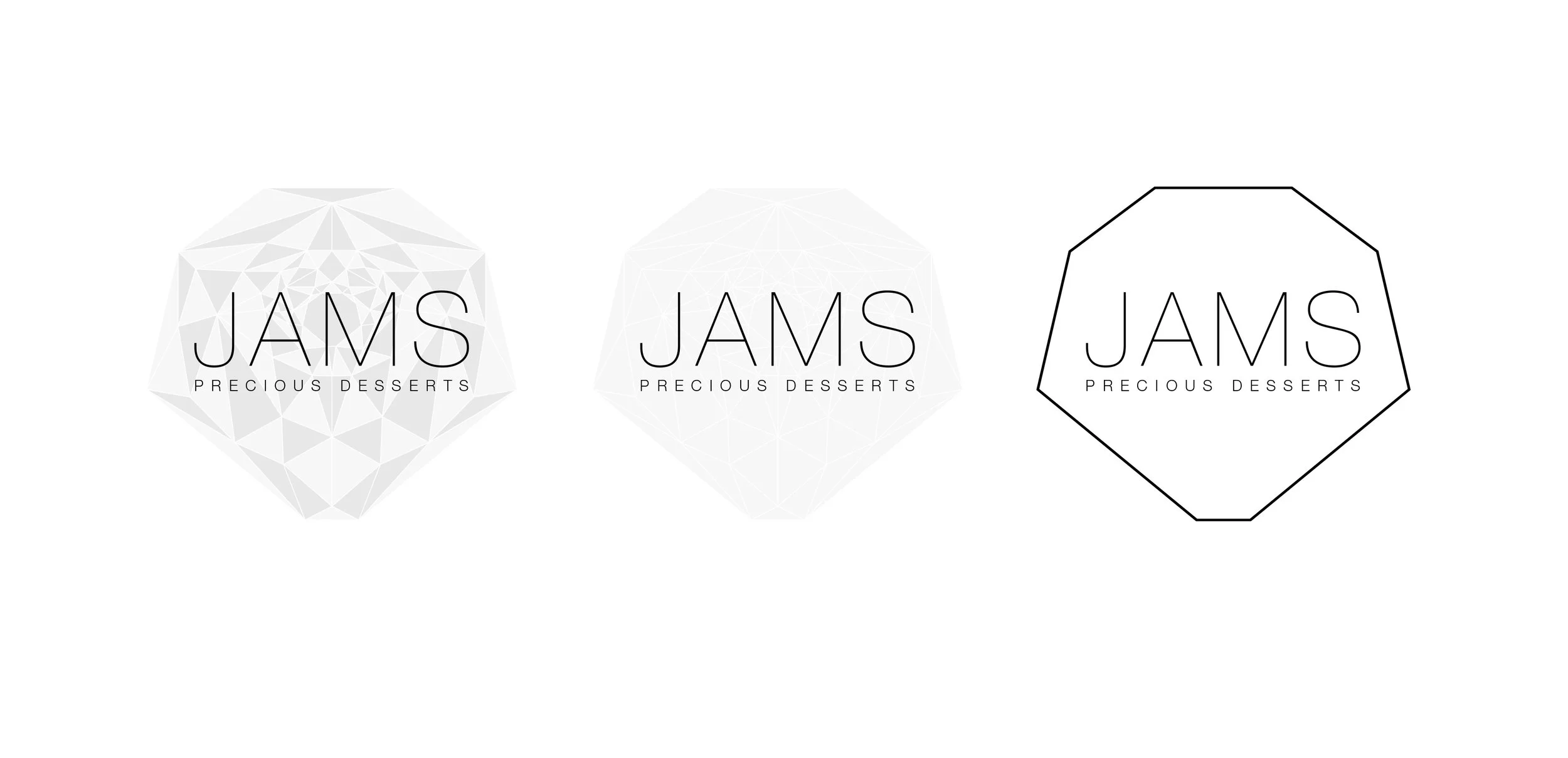
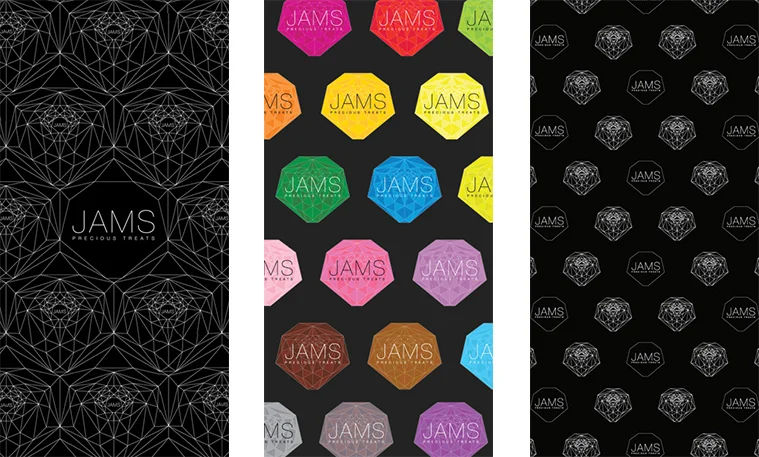
Started by playing on the homophonic nature of the two words – jam and gems. And thus the name JAMS was born. The idea of ‘jams’ as ‘gems’ is translated visually to the logo and all the collaterals (signages, menu etc), with them looking like diamonds and stones in various hues. The rest of the store is anchored by a series of precisely cut furniture, as how one would shape and cut diamonds